

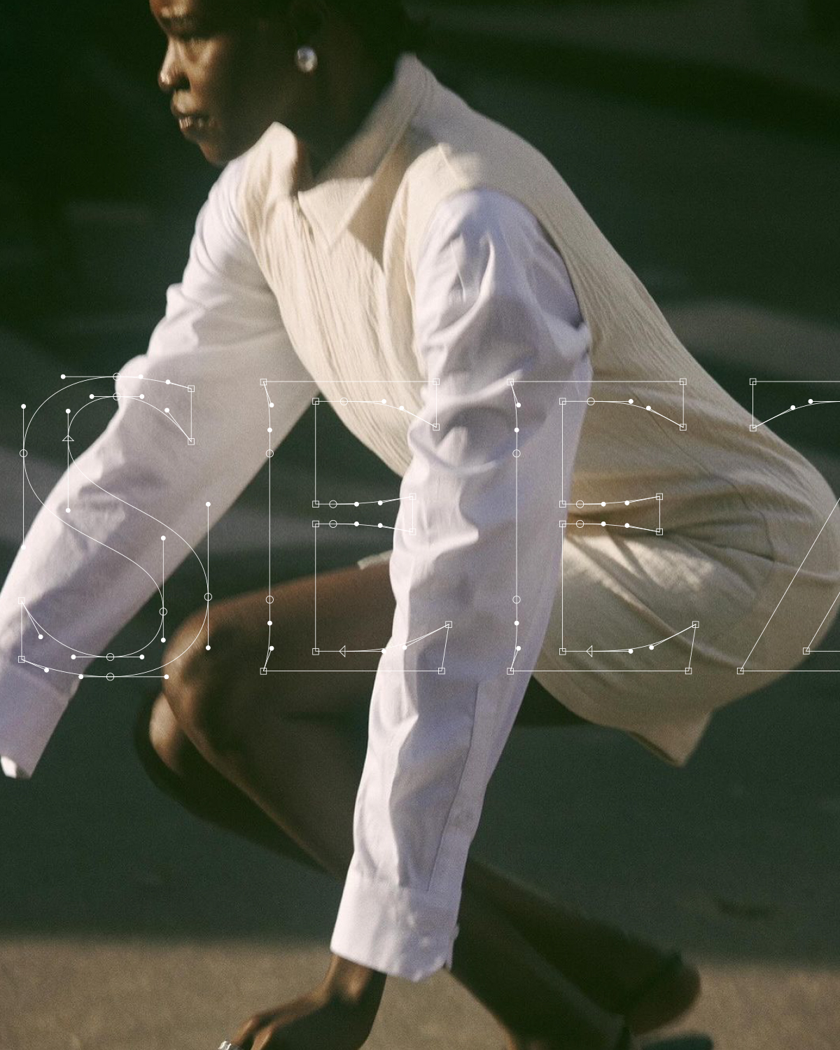

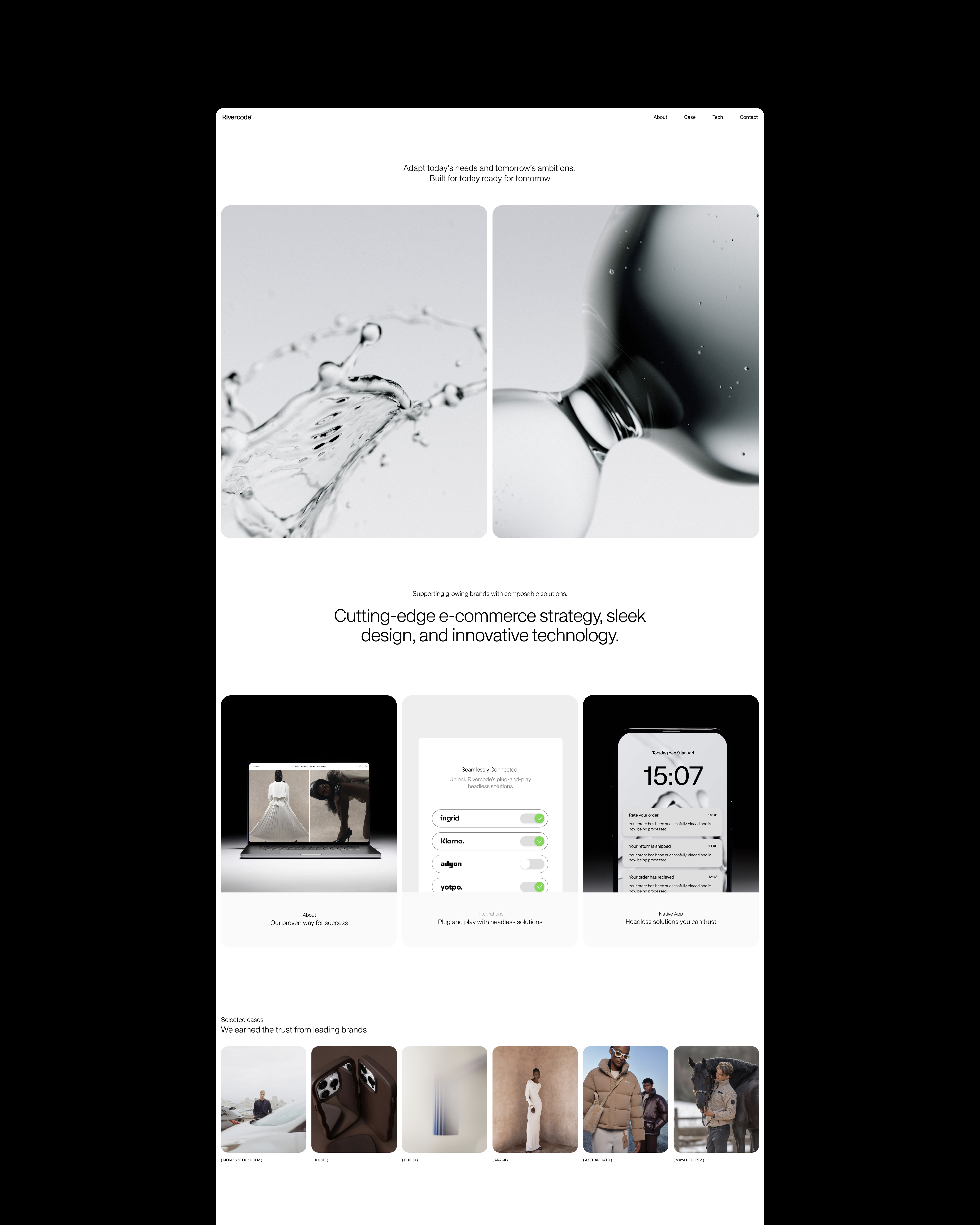
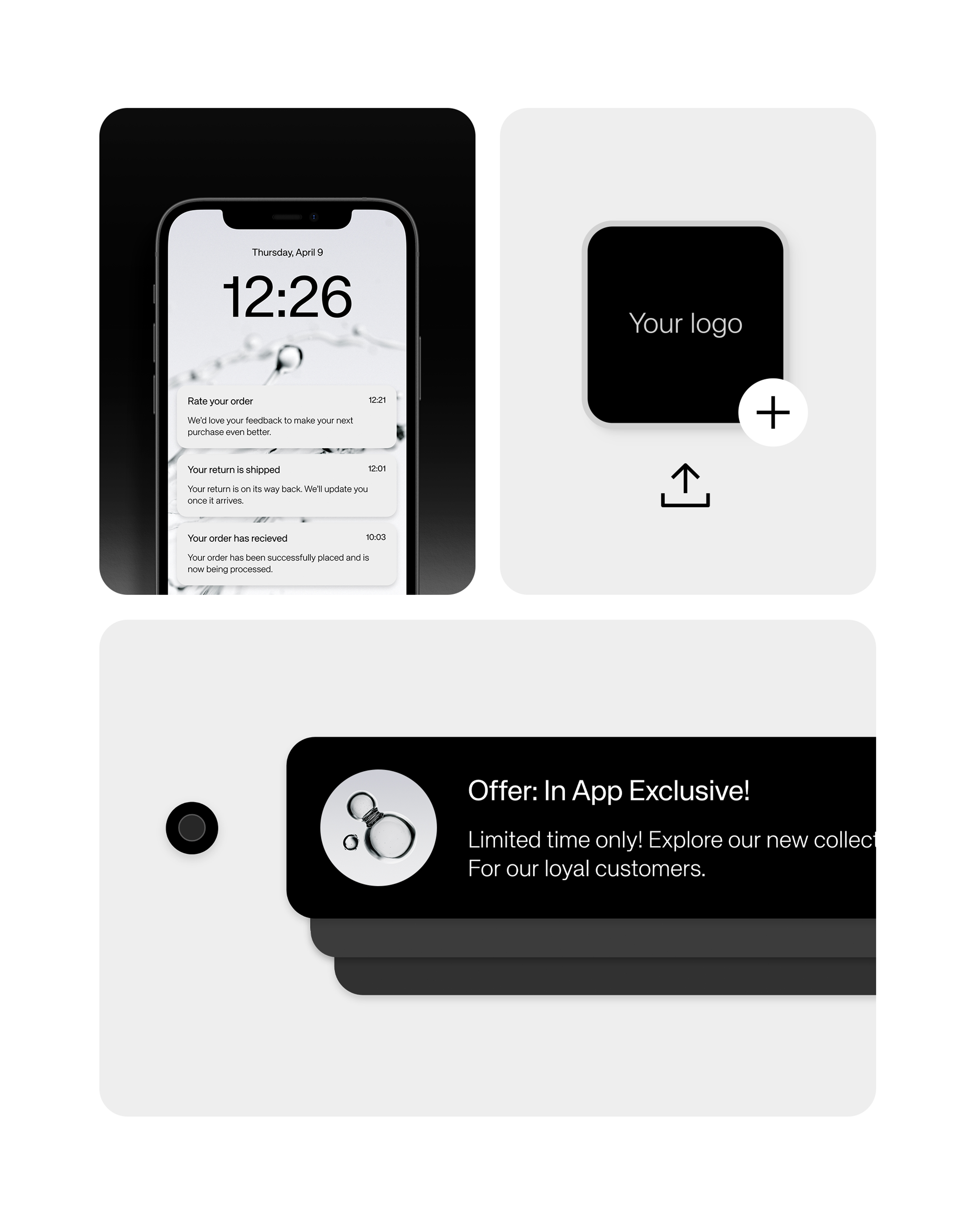
Rivercode’s identity highlights their technical expertise through a clean, code-inspired design that clearly communicates the value of their solutions. The expression signals precision and confidence – letting the work speak for itself through a visual language that is clear, recognizable, and their own.


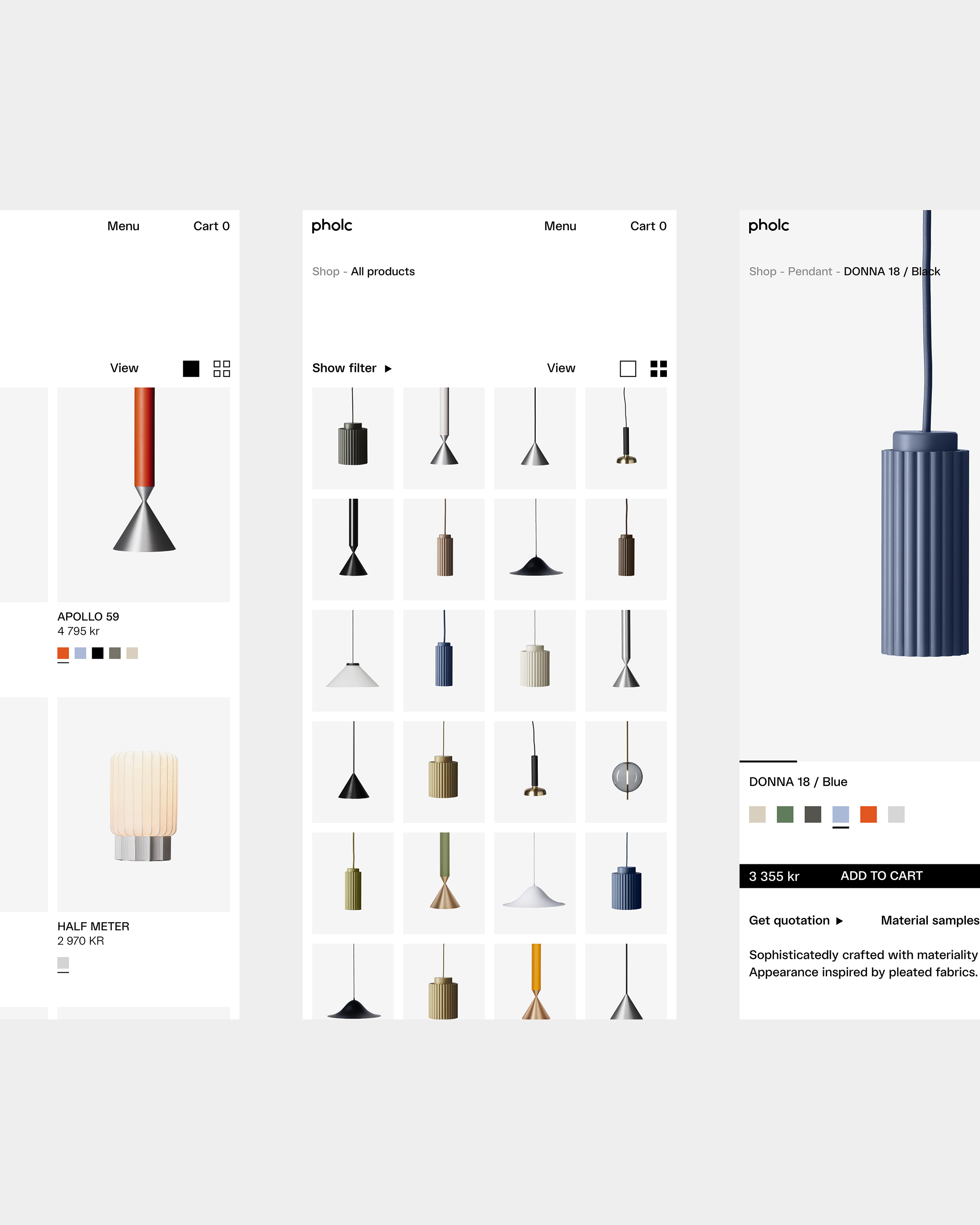
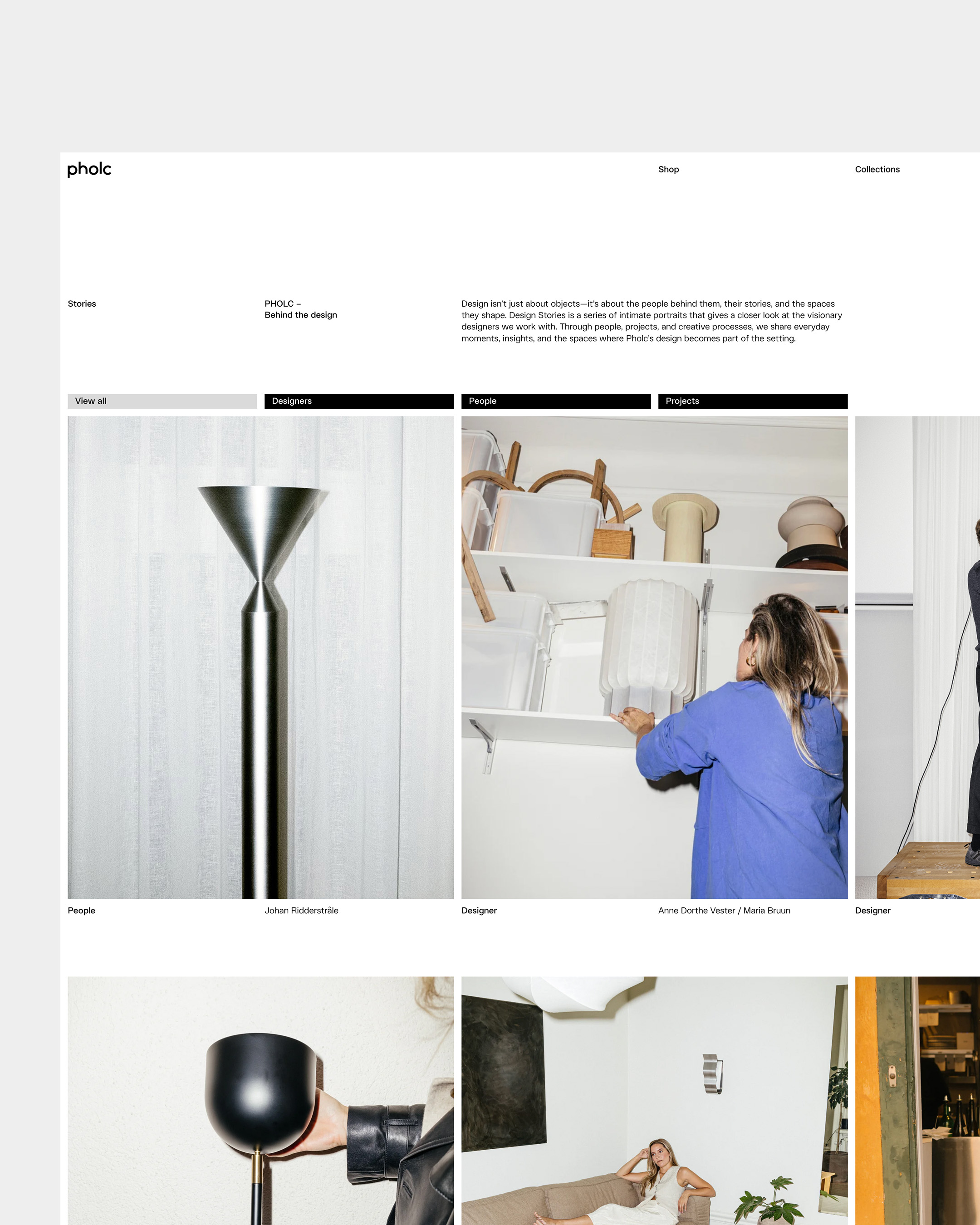

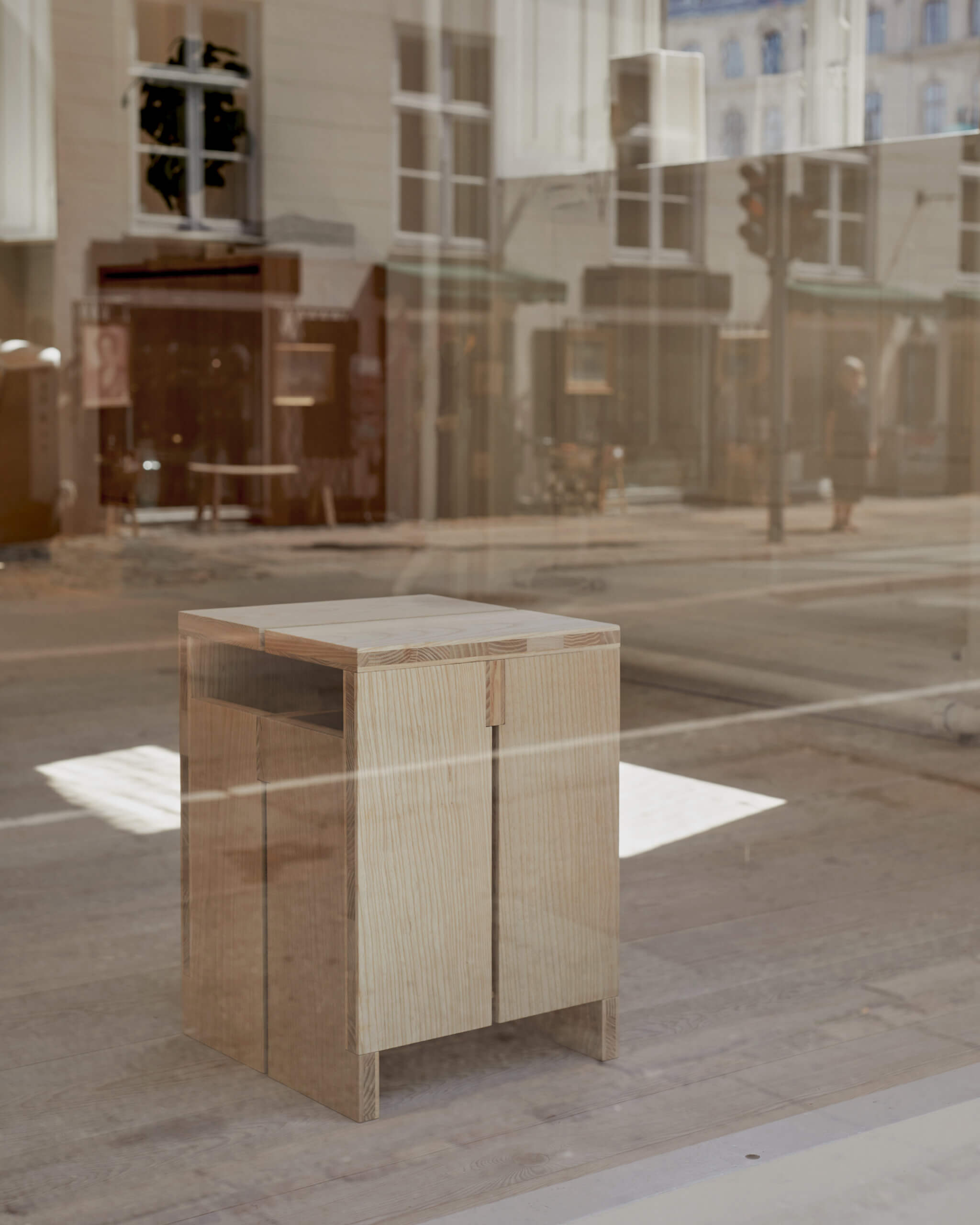
I designed Pholc’s website with interior architects in mind – an audience that doesn’t need to be convinced, but inspired. Through tone, motion, and subtle detail, I created a digital experience with feeling at its core. The site offers both clarity and depth, with thoughtful solutions that highlight the designers, the collection, and the calm, refined character of Pholc’s brand.
Packaging & Website
Skeppshult
03–01–2025

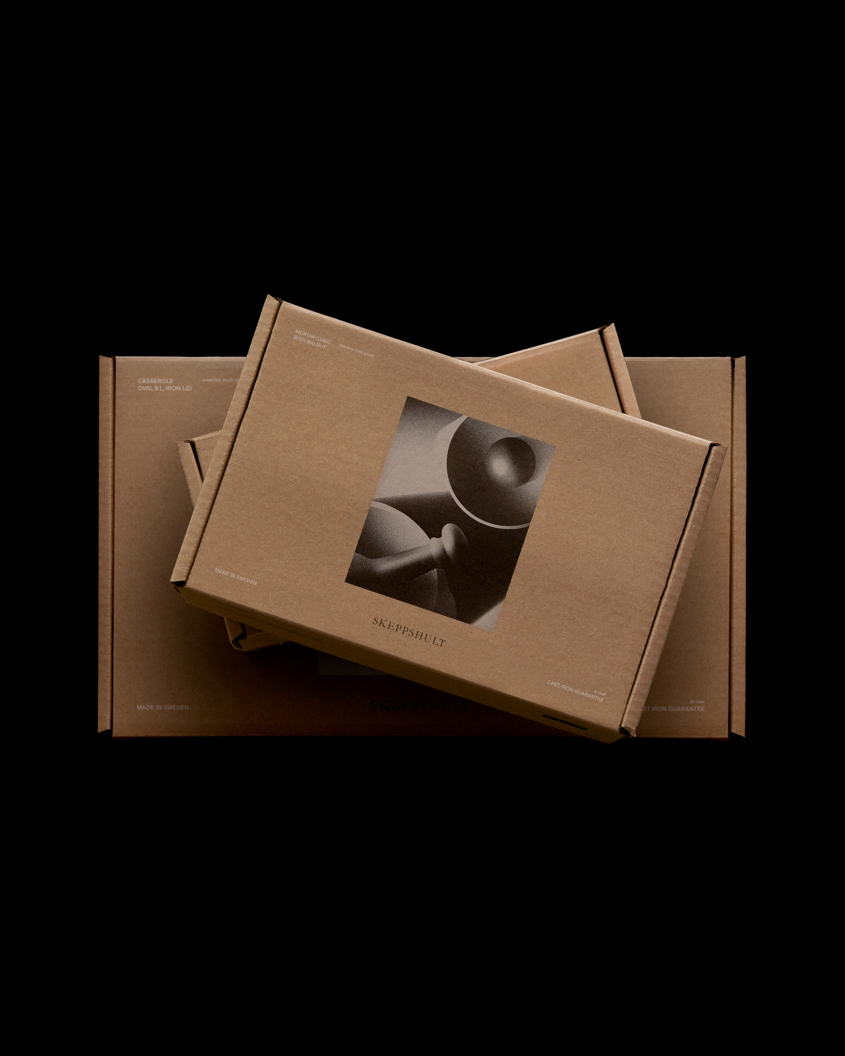

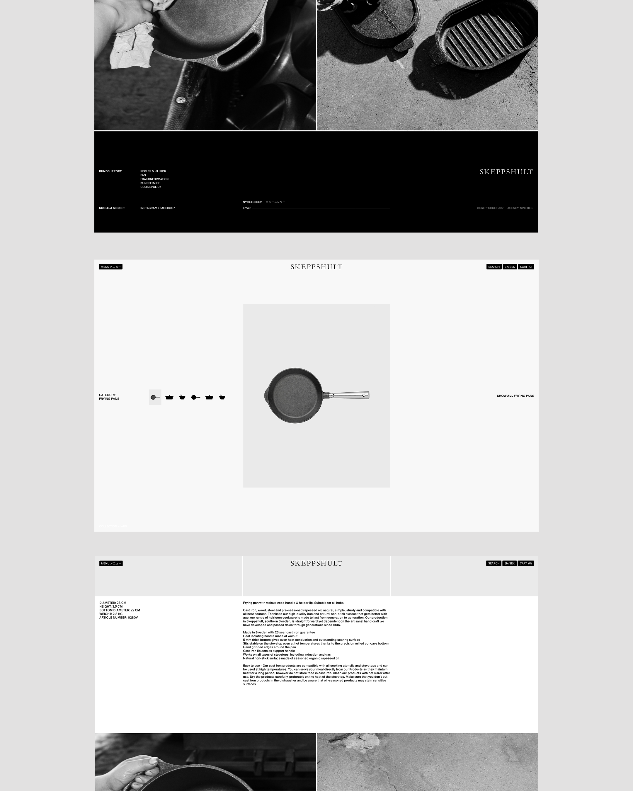

Packaging and UX design for Skeppshult built on the product itself – its rawness, weight, and craftsmanship. Through a pared-back web design and a simple, functional packaging concept, I shaped a whole that feels like a natural extension of the product. With respect for tradition – but also with the courage to challenge it and move the brand in a more modern direction.
Crafted from what’s left behind
Chevron
10–13–2024


